Visualizing Literacy of Children in School
InfraVis User
Åke Grönlund (ORU),
Gustaf Öqvist Seimyr (KI),
Olga Viberg (KTH)
InfraVis Application Expert
Liang Zhou (MIUN),
Filip Berendt (KTH),
Sergey Ignatenko (LiU)
InfraVis Node Coordinator
Mario Romero Vega (KTH)
Tools & Skills
CSS, D3, HTML, React, Information Visualization, JavaScript, Scatter Plot, Bar Plot, Violin Plot, Filtering, Mapping
Keywords
Literacy, School, Lexplore, Children,
Background
Learning to read and improving literacy have long been essential components of elementary school curricula. Literacy is a critical skill for participating effectively in modern society. Because of its importance, several methods and tools have been developed to facilitate the learning process, and new ones continue to emerge. Gustaf Öqvist Seimyr, a researcher at Karolinska Institutet (KI) in Stockholm, co-founded the company “Lexplore” to create a platform that uses eye-tracking technology and artificial intelligence to help teachers assess their students’ literacy levels more accurately. This, in turn, allows educators to offer targeted challenges and intervention programs. Each session is assigned a “Lexplore Score,” which is used to evaluate a student’s performance. The evaluation system developed by Lexplore has proven to be effective in supporting these assessments.
Åke Grönlund, a senior professor at Örebro University, focuses his research on how digital tools can improve society. Olga Viberg, an associate professor at KTH Royal Institute of Technology, investigates similar topics, particularly self-regulated learning and digital assessment tools. Given the vast amount of data generated by Lexplore’s platform, they are interested in exploring whether this data can reveal trends and insights at a broader level, beyond individual students – across a class, academic year, school, or geographic region. Such insights could help researchers better understand the data and aid school staff in making informed decisions when designing curricula.
Although the specific details of Lexplore’s dataset for this visualization are not discussed, the project aims to display various columns of personal information about students and their Lexplore test performances on a 2D canvas, with multiple filtering and aggregation options.
Source(s) used: Åke Grönlund, Gustaf Öqvist Seimyr
Project Details
The first part we had to deal with was to decide how the application and the visualization it provides is delivered and made available to the user. Because this project deals with multiple potential users with no real specific location to speak of, we decided that this visualization would ideally be accessible in the form of a web application. D3.js is a JavaScript library developed for making visualizations in a browser setting. To facilitate the development of the user interface, we decided to employ React, as well. The web application can be hosted from GitHub’s own webpage hosting service, GitHub pages, but can also be hosted on a regular web server. Because of the confidentiality requirements on the dataset, the application is served to the client browser without any data, at which point the user locally loads their data to the application; no transfer between devices.
The overall development process has been very iterative. With the users not very informed themselves of what to expect, it has been difficult to ask of them what they would request. Therefore, we have been suggesting features we thought would serve them well, and then evaluated their response to it. If something works well for their tasks, then it goes in the experience, and if not, it is rejected. The whole process could be documented in full, but to keep things short and concise, each part of the visualization will be presented and explained, rather than all the different versions of it.

Canvas
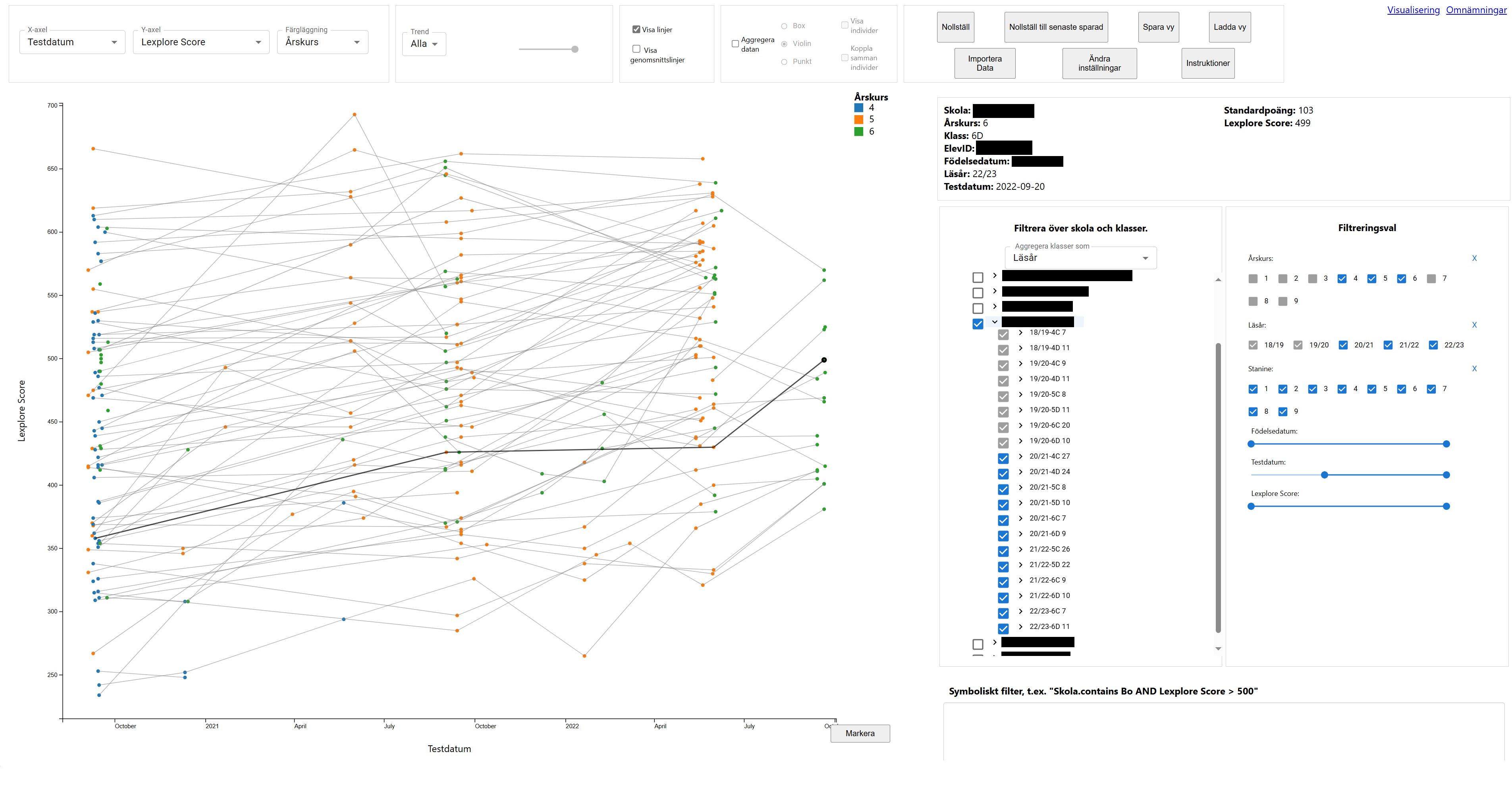
The canvas is the focal point of the entire visualization, as it is here the visualization is served after all the parameters have been set. You can pan and zoom across the canvas, and you can select individual data points or do a box selection of several to highlight them and display their details in a separate section. The axes displayed correspond the the choice of axes to present, and then will dynamically follow the navigation of the canvas.
There are two main ways of presenting the data on the canvas; individual view and aggregational view.
As the name implies, in the individual view, each data point is displayed as itself and it corresponds to one person at one test session.
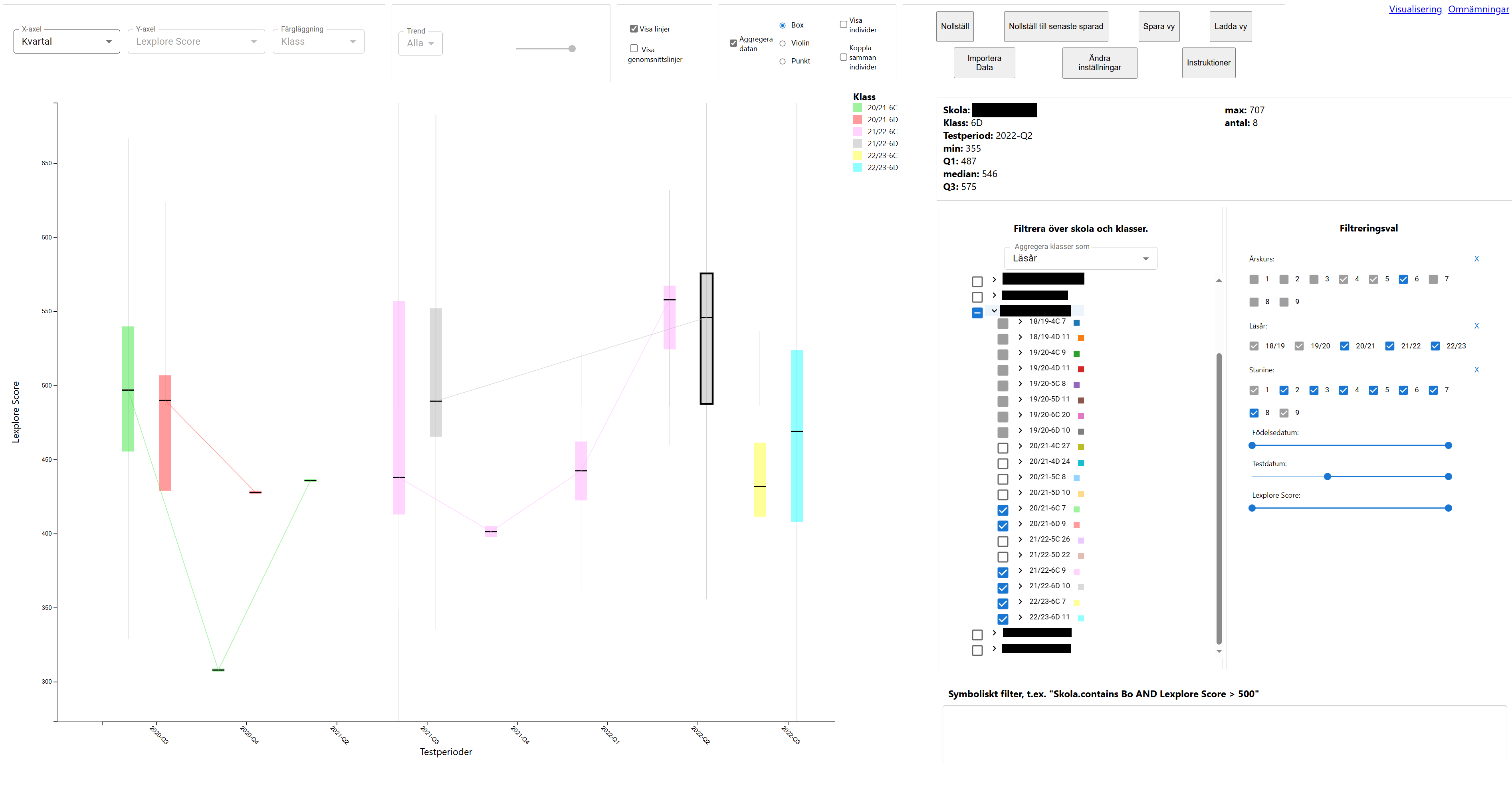
In the aggregational view, data points that belong to some kind of grouping, in this case class or sequence of classes over more than a year, are aggregated and displayed as single data ‘points’, in the form of box plots or violin plots.
Depending on the view chosen, it has some effects on some of the other features of the visualization.
Attribute Selector
This selector simply allows you to switch which attributes are displayed for each axis and for which attribute you assign different colors to the data points. Depending on whether you show individuals or aggregates, the options for these differ a little, with the most notable difference being that only Lexplore Score can be displayed on the y-axis and only temporal attributes on the x-axis for aggregational view, because the other attributes are hard or meaningless to aggregate.
Trend Filter
This filter works to show individuals who in some metric is trending negatively in their showed performance. It doesn’t work for the aggregational view. The threshold and criteria (latest performance, overall performance, etc.) is set dynamically by the user.
Line Toggle
The toggles here allows the user to toggle on and off two different lines. The first type of line binds several instances of any unit together, to see the over all temporal trend of them. The second type of line shows national or regional averages.
Aggregation Toggle and Options
This toggle allows the user to switch between the aggregational and the individual view. When aggregating, additional options are presented. These options concern the different ways of displaying the aggregations described above, but also whether or not to show individuals and their lines.
School and Class Filter
This filter simply allows you to select which schools and/or classes of different academic years to display data from. The list is filled dynamically by the dataset. The filter options are highly-customisable, allowing the user to with low effort display any selection of class units. The filter also enables aggregating over several academic years, if needed.
General Filtering Options
The general filtering options allow the user to filter more broadly over generic attributes of the classes or individuals. This, in conjunction with the School and Class Filter allows the user to easily exclude entire swaths of data points that won’t ever be relevant for this particular round of experiencing the visualization.
Symbolic Filter
The symbolic filter allows an advanced user to enter logical statements to supersede all other filtering options, by typing it out using logical and comparator operators. If left empty, it plays no part in the visualization.
Details-on-Demand
Whenever a selection is done in the canvas, the details of said selection appears in the Details-on-Demand box. It displays the attributes of the selection, or an aggregational representation if it involves more than one data point.
Functional Features
The functional features allow the user to more easily curate the visualization experience. From here, the user can save or load a specific view represented as a json-file, reset the view to default or to the latest saved view, import the data to be visualized (as the visualization is served with no data to begin with), change some settings for the advanced user, and open up the built-in instruction manual.

