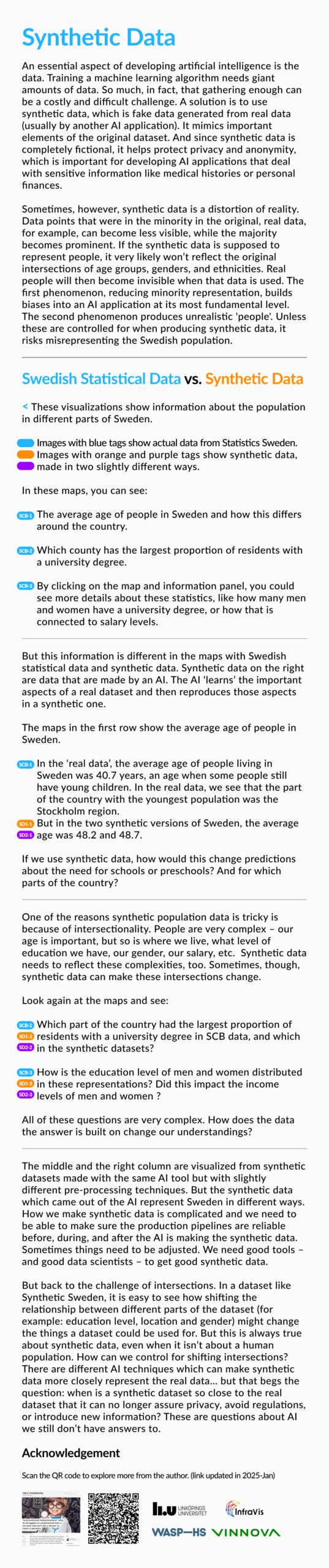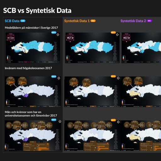
Synthetic Sweden – Exploring applications and limitations of synthetic demographic data
InfraVis User
Ericka Johnson (LiU)
Saghi Hajisharif (LiU)
InfraVis Application Expert
Yin He (LiU)
Måns Gezelius (LiU)
Rickard Falk (LiU)
InfraVis Node Coordinator
Lonni Besancon (LiU)
Tools & Skills
Figma, Unreal
Keywords
UX design and development
About
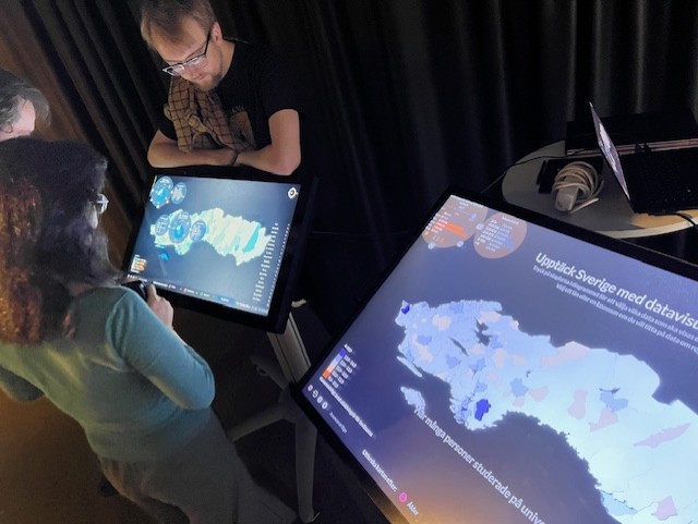
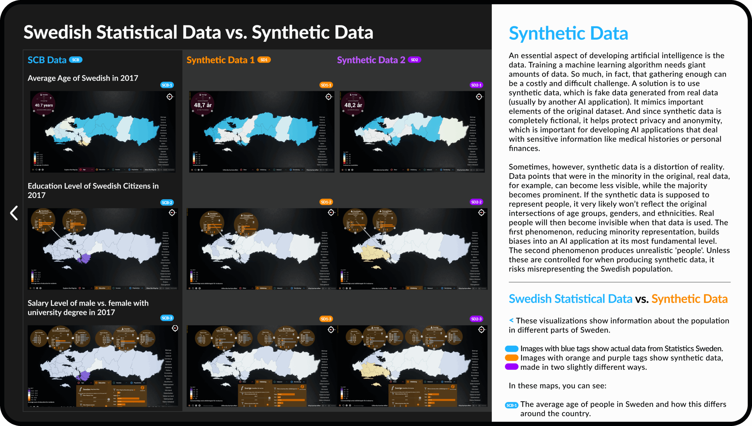
This project introduces the concept and application of synthetic data through an extension of the existing “Sweden-in-Numbers” touch table installation at the Visualization Center in Norrköping. The installation was originally designed to engage visitors with national statistics via interactive data visualization. The platform now expands to explore how synthetic demographic data can be communicated in an accessible and meaningful way.
Supported by InfraVis, the project integrates two sets of synthetic data generated by Saghi Haijshari using machine learning techniques, accompanied by a narrative from Professor Ericka Johnson that highlights both the potentials and limitations of synthetic datasets from a social science perspective.
Over one year (300 hours), the UX designer Yin He explored how to present this relatively new and unfamiliar topic to the public in a clear and engaging format. Måns Gezelius created the interaction, while Rickard Falk worked intensively to convert the synthetic data into a functioning visual map, bringing synthetic data into the immersive exhibition environment.
This collaboration represents an important step in making complex data concepts, like synthetic data, more approachable for broad audiences through visual storytelling and interactivity.
The Data
For synthetic data generation, the CTGAN model was employed (https://github.com/sdv-dev/CTGAN). The original data (made available by IAS through Statistics Sweden’s secure servers, project grant VR 2013-07681.) comprised the Swedish Census of 2017, which included over seven million records. Due to computational constraints, including the absence of GPU resources and limited server capacity, a randomly sampled subset of the data (0.01 of all data) was used for training. Given these limitations, the model was trained for fewer epochs than recommended in the original CTGAN implementation. The trained model was then used to generate a synthetic dataset with the same number of records as the original to allow direct comparison between the two. After generation, the synthetic data were post-processed so that all feature values remained within the valid ranges of the original dataset.
Challenges & Opportunities
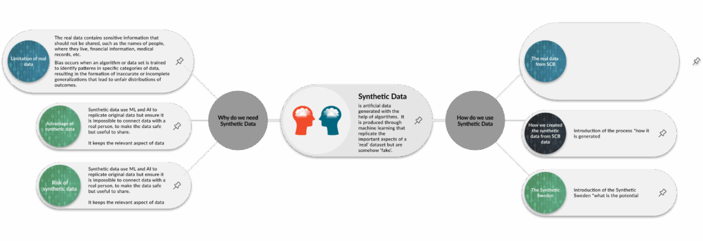
One of the key challenges in this project was communicating the concept of synthetic data—a complex and unfamiliar topic—to a general audience. Unlike traditional statistics, synthetic data involves simulated datasets that resemble real-world information without exposing actual personal data. This abstraction can be difficult for non-experts to grasp.
Another challenge was translating abstract data and academic insights into intuitive, engaging visuals. Finding the right visual language and interaction patterns to make synthetic data meaningful (but not misleading) required careful content and design iteration.
From a technical perspective, integrating the data into a real-time, interactive Unreal Engine environment brought its challenges. Mapping and formatting the datasets to work smoothly with the system demanded both creativity and technical precision.
Despite these hurdles, the project offered exciting opportunities. It pushed the team to explore new forms of science communication, using visual storytelling to build understanding around emerging data technologies. It also demonstrated the value of interdisciplinary collaboration, bringing together social scientists, data scientists, designers, and developers to create something accessible and thought-provoking.
Navigating Uncertainty Through Design
This project began with an open-ended challenge: how do we tell a compelling story about synthetic data—something abstract, unfamiliar, and difficult to visualize?
To navigate this ambiguity, we adopted a collaborative, iterative design process. Design tools were used not only for prototyping but also for facilitating communication between team members from diverse academic and technical backgrounds. Co-design workshops, visual mapping, and storytelling exercises helped align perspectives and gradually clarify the direction of the project.
One major design challenge was translating technical terminology and conceptual frameworks into public-facing content. To address this, the team experimented with multiple formats—simplifying language, utilizing visual cues, creating analogies, and using interactive visualization to make abstract data more digestible and relatable.
The resulting prototype—a touch-table map with synthetic data—offered a novel way to visualize demographic information. This outcome revealed the importance of holistic narrative structure in communicating complex data. As a result, the team shifted from an exploratory mind-map format to a more linear narrative that better supported user comprehension.
This task highlights how design methods can serve as cognitive and collaborative tools in research settings, particularly when working with abstract or unfamiliar content.